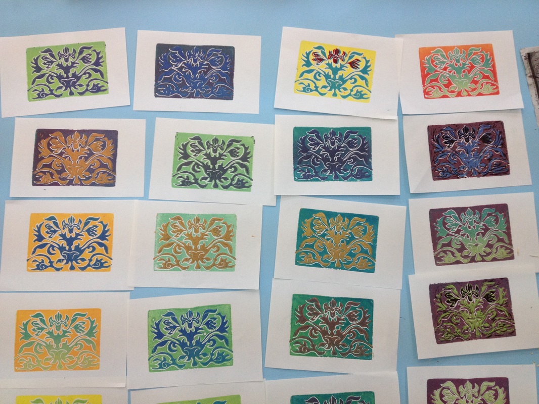
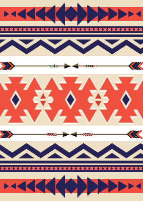
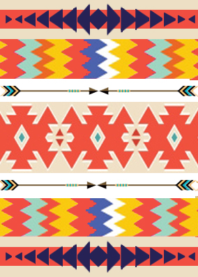
I deliberately chose 3 very different types of patterns from 3 very different parts of the world to get as much variation as possible and I think I have been successful at making them very different.
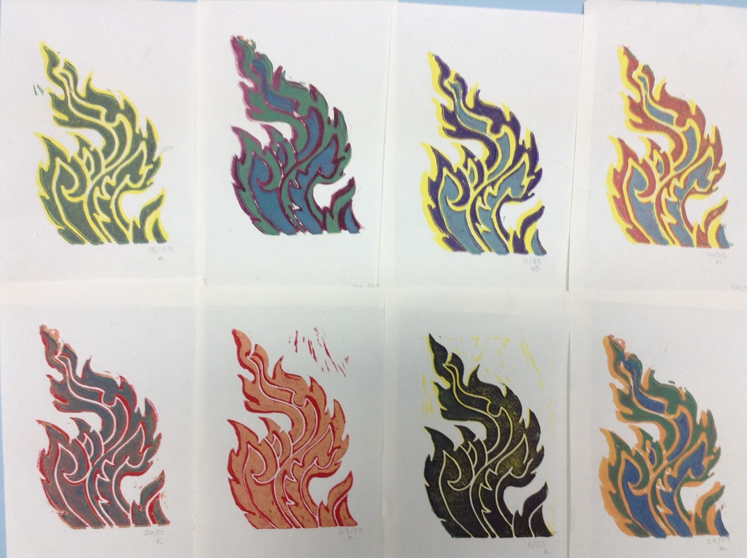
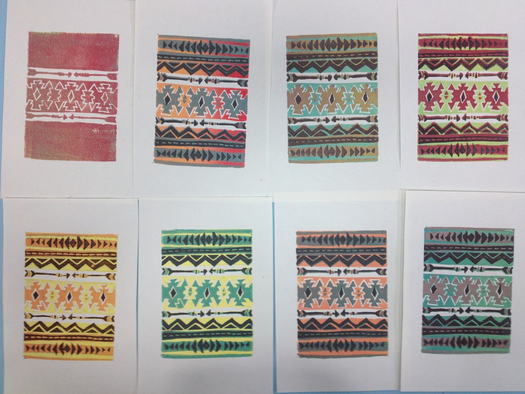
The First, the Aztec pattern, is more like a pattern in that it has repeating shapes in a linear format, the other patterns, the Thai and Elizabethan, are more of a graphic design than a pattern since, even though there are repeating features, the repetition in not continuous. In the Thai we see the repetition of the pointed tips at the edges and on the Elizabethan we see the same sort of curling leaves repeated and not to mention that it is symmetrical, or close to symmetrical. Yet with the later designs they are not as predictable as the Aztec.
The shapes in the Aztec are vey geometrical with no exceptions where as in the others use organic shapes. This maybe because they try to represent organic objects; fire and a plant. The Aztec has little to not representation apart from the small arrow within the pattern.
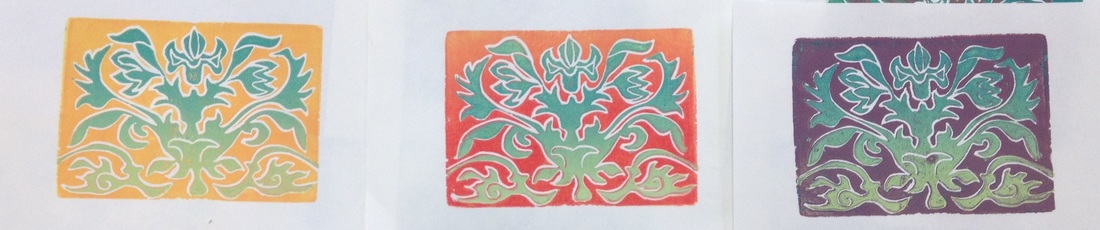
The colours chosen for the all prints are as far from realistic as possible and this is because I wanted to create a new take on a historical reference: take what is there and chose the opposite. The Aztec colours are soft and gentle, where as they were a fierce and threatening war paint for their soldiers. The Thai fire, normally golden or you might expect to see fire as yellow or red is now green, yellow and blue tones. The Elizabethan with the tonal effected added and strong reds, oranges, turquoise. Before we’d expect to see pastel and muted tones in such a design.
After the tree designs were successful because of their colours but if I could change something I’d design them to all be Portrait or all landscape because they don’t seem to match being a mixture.
The First, the Aztec pattern, is more like a pattern in that it has repeating shapes in a linear format, the other patterns, the Thai and Elizabethan, are more of a graphic design than a pattern since, even though there are repeating features, the repetition in not continuous. In the Thai we see the repetition of the pointed tips at the edges and on the Elizabethan we see the same sort of curling leaves repeated and not to mention that it is symmetrical, or close to symmetrical. Yet with the later designs they are not as predictable as the Aztec.
The shapes in the Aztec are vey geometrical with no exceptions where as in the others use organic shapes. This maybe because they try to represent organic objects; fire and a plant. The Aztec has little to not representation apart from the small arrow within the pattern.
The colours chosen for the all prints are as far from realistic as possible and this is because I wanted to create a new take on a historical reference: take what is there and chose the opposite. The Aztec colours are soft and gentle, where as they were a fierce and threatening war paint for their soldiers. The Thai fire, normally golden or you might expect to see fire as yellow or red is now green, yellow and blue tones. The Elizabethan with the tonal effected added and strong reds, oranges, turquoise. Before we’d expect to see pastel and muted tones in such a design.
After the tree designs were successful because of their colours but if I could change something I’d design them to all be Portrait or all landscape because they don’t seem to match being a mixture.
 RSS Feed